TD Wealth Investor Triage

Shown is an earlier iteration of the prototype not used in the usability test.
OVERVIEW
Challenge
TD Wealth has a robust suite of offerings for investors, from direct investing solutions to higher-touch Financial Advisors and Private Wealth Managers.
Though these products and services are in place, TD Wealth would like to do a better job at acquiring new investors from both its secure and nonsecure platforms, as well as retain and graduate customers through its tiers of investing offerings, and would like a re-imagining on a better journey for new investors.
Delivered
An entire Strategy for a new triage section, including usability-tested wireframes, plus all artifacts leading to the final wires. This Strategy encompasses both non-secure and secure platforms to reach various demographics with personalized messaging.
Discovery
Needs assessment: Stakeholder Interviews
First came the knowledge gathering, starting with conducting a workshop of all stakeholders to assess the problem space of acquiring new and graduating existing investors. We (group of 3 - I was Lead UX, also a Strategy person and Visual Designer) were interested in finding out the current problems from the stakeholder point of view.
Some things we heard:
TD triaged based on assets before needs ($ value before “values”)
We asked customers to do all the work in understanding how they can invest with us.
We weren’t making good use of our secure platforms to generate quality leads.
We just don’t graduate customers.
We make it complex for customers who have dual relationships with us (high net worth & direct investing).
Needs assessment: Prospective client interviews
Next, we interviewed 14 individuals identified in 3 groups: prospective investing clients with at least $35k to invest who were not current customers of TD, prospective clients who already had a customer relationship with TD, but were not yet investing with TD, and 2 high net worth individuals with assets of at least $1MM who did not have an investing relationship with TD.
Some things we heard:
TD hadn’t ever reached out to them to start a conversation about investing or wealth needs.
TD didn’t offer clear & compelling proof points for investing.
TD fit people into broad categories and didn’t provide personalized recommendations.
Too much choice with little guidance.
Investing is complicated, and TD made doing business with them too difficult.
High net worth individuals get their investing information via word-of-mouth, and do not as a rule seek this info out online.
Needs assessment results
Then, we did an exercise to find common ground and disparities from everything we’d heard:
“I expect TD to know me and start the conversation.”
“I need clear reasons to invest with TD.”
“I want TD to understand my needs.”
“I expect personalized recommendations. Don’t fit me into a box.”
“Make it easy to do business with TD.”
It may be less advantageous to seek high net worth individuals in the online channel.
Note: This is just a subset. There were many more, which were used to create the Opportunity Areas below
Competitive and Self Heuristic Evaluations
I also took a look at competitors and at TD with an expert walkthrough, taking note of mostly qualitative differences. I made charts for quick comparisons and references. I brought these to the team as part of the knowledge gathering exercises.


Opportunity Areas
You will notice the Use Cases and User Flows have 3 zones. These were not by accident; I took the Needs Assessment Results as well as the Competitive and Heuristic evals and broke that down into 3 meaningful areas of our user journey, that I call Basic Opportunity Areas. This was to ensure we had coverage over all parts of the ask of pointed, desirable qualities, and that no part of the use cases or flows lived outside it. This exercise was done using sticky notes, but I have no pictures of the process. This step really helps to coalesce what I’ve heard into a real vision, as well as keeping it strong and present throughout actual design considerations.
Awareness
Discoverability and Wayfinding
Make it easy for prospective investing clients to contextually discover and access TD’s investing options from the homepage and navigation.
Proactive Outreach
Understand and engage prospects in an ingoing dialogue about their investing & wealth management needs. Target content and offers based on financial triggers, articulated needs and digital behaviours.
Stage Setting
Demonstrate the value of investing with TD upfront, and embed relevant proof points throughout the experience.
Triage
Fast Track
Minimize the number of steps required to provide prospects with a recommendation. Provide context as to why certain information is required.
Grow Better Investors
Provide helpful feedback and guidance on users’ inputs. Educate and empower prospects to act with confidence.
Support Decision-Making
Support decisions at critical junctures and provide comprehensive recommendations. Let prospects refine their choices based on amount of investable assets.
Provide Assistance
Provide the opportunity to connect with a TD Investing specialist at any time for further advice and guidance on TD’s investing options.
Acquisition
Reduce Barriers
Minimize barriers to becoming a TD investing client. Appropriately elevate contact or robo investing. Always include accessibility concerns.
Best Match
Provide a way of having the best advisor match.
Personas, Use Cases & User Flows
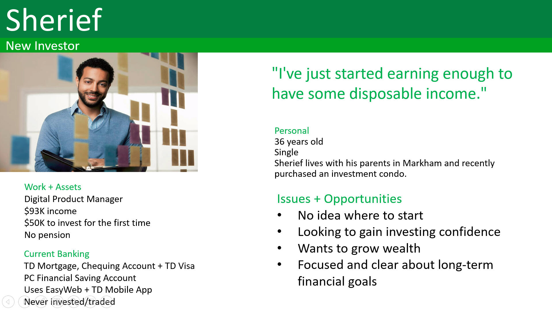
Then, using the information from our interviews, I came up with 4 personas for the project: Sherief, a new investor, Lindsey, representing direct investing, Eric who is mass affluent and Dr. Maquiera, the high net worth investor. As a group, we iterated on these, and when we were satisfied, brought them to the stakeholders for further validation.
After the personas came the most critical part - I wrote plausible use cases for each (which were also iterated upon with my teammates and validated with stakeholders). In this case, because of the narrow scope of the ask, this meant one use case per persona. From these use cases came the User Flows I wrote, which marries the respective story to actual pages and features that will need to be built.
A notable outcome of writing these plausible use cases is we could see how the High Net Worth individual would likely bypass online triage completely, and instead might come across TD in the context of a thought leadership piece, and thereby contact the author directly. This changed the scope of the triage on a fundamental level.


Design
Experience Principles
These principles are just a listing of boiler-plate, non-negotiables to keep in the back of my mind as I go about designing the actual wireframes. They do change with each project, depending on need, but mostly, they tend to stay the same within the same type of business. For the wealth side of FinTech, I notice that a sweet spot is with these, and so these are the ones I used for this project:
Relevant & adaptive - go for the best experience, but keep in mind what is there today, so scaling back to an MVP isn’t a headache
Streamlined - provide structure to complex ideas, restrict choices to aid decision-making
Conversational - respond to user input & actions, provide immediate feedback, error messages are clear and located where it’s easy to figure out the necessary fix
Empowering - give encouragement, incentives and support to move the prospects forward
Aspirational - chart the path for prospective clients to achieve what matters to them
Prototype
With everything I’d learned, I made a preliminary design (I don’t have a bare wireframe to show for this step, as it was created just for design to be applied to it for prototyping, but you will see an example further down this page). Our Visual Designer applied design, we got a Copywriter to create copy, and then I took it back to create a clickable prototype to use in our Usability Test. The prototype was made using Axure (I’m also comfortable using Sketch for prototyping). The link to the prototype is here - password: wealthwork. If the link is no longer working, I’ve included some screenshots of the wizard portion of it below.
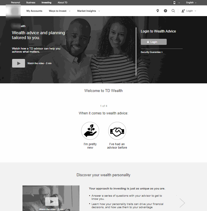
Step 1

Step 2

Step 3
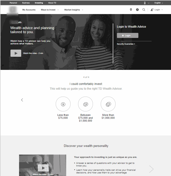
Step 4
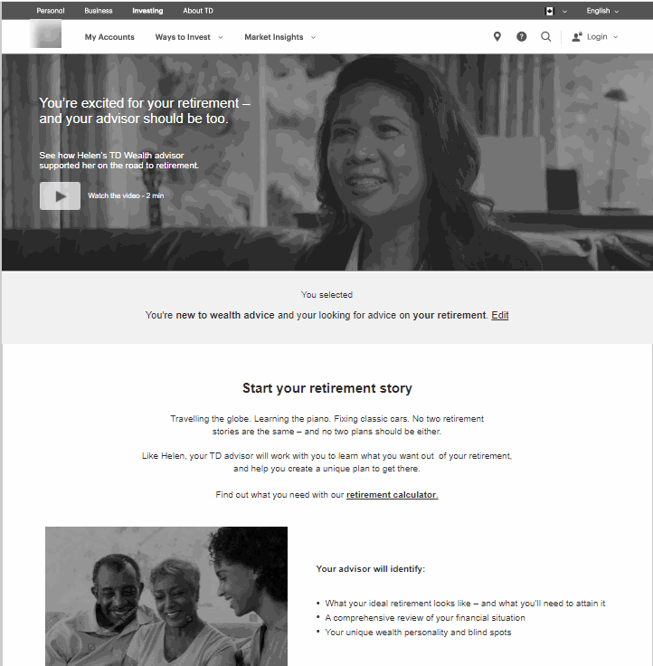
Step 5
Test
Usability test
The prototype was tested with 24 users, 6 for each of the 4 segments. Although all participants had no issues interacting, lots of salient, actionable issues were uncovered, including:
Too generic
Overall, the majority found the suggested results and options not customized for their own needs.
Address their goals
The participants, across all segments, were driven by their individual goals. The goals fell into several categories, and we saw them crop up again and again.
Education was necessary
The majority (except the High Net Worth individuals), expected more guidance as they were new investors, so they couldn’t tell whether the recommended optionsn were a good match for their needs.
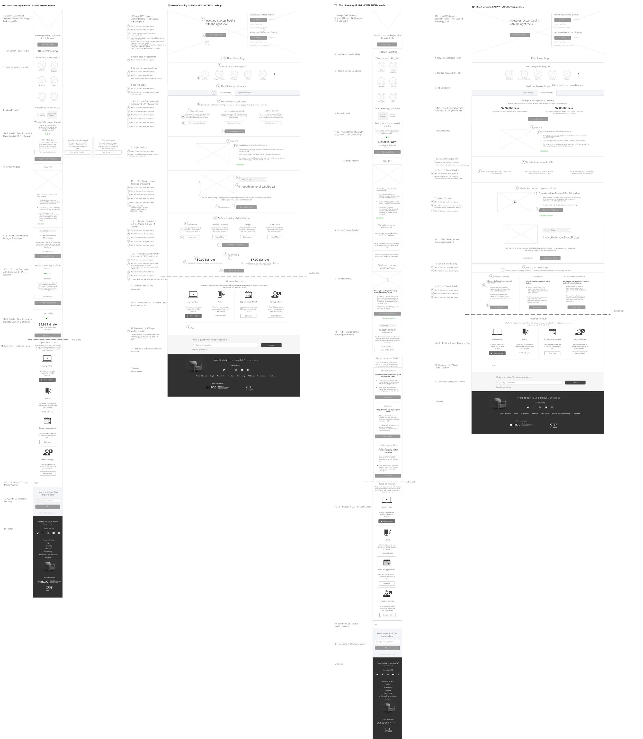
This is where the journey ends, but the learnings echo into the current site redesign.
As with a lot of projects like this, it was mostly a recon mission to find strong, up-to-date experience pillars to stand on, unfettered with current site design. Although the initial ask included not adhering to TD’s components and try something new, for the MVP the bank decided to stick to its current roster of components (until the new CMS system and infrastructure are in place in the last quarter of 2021 and into 2022).
For now, the learnings absolutely show up in the Direct Investing, Wealth landing, and on the Financial Priorities pages, both in content and in structure; the Financial Priorities and Wealth pages even utilize the additional floating menu to connect the user to an Advisor, just as the prototype had done, which is seen nowhere else on the entire TD site.
I know that is so because I also designed those experiences and created the wireframes, with an example shown here. See a larger wireframe view